Updated: Sep 20, 2021
Hi friend! Happy Monday! This week I’ll finally release my first video on my YouTube channel. In case you haven’t subscribed to the channel yet, please do the right thing. When possible, I will use this blog to explain a concept I gloss over in the videos. Therefore, without too many spoilers, this week I want to talk about pivot tables.
Pivot tables help you get insights from your data and create reports quickly. You could have a spreadsheet with 1,000,000 rows of data and a pivot table can summarize that data in under 30 seconds depending on what questions you are asking.
Our friend, Yücel is on vacation. We will talk about that soon but for now, let’s stifle our envy and wish them the best as they travel during these interesting times.
Today we are solving Jane’s problem:
Time check: Sunday 10th September at 7.59PM: Jane, who works as a Sales Manager at Big Sleep Arts, lied on her CV about her Excel proficiency and Yücel came to collect. Big Sleep Arts has 3 regions (or branches) in Youganda: Gulu, Luzira and Soroti. Before Yücel left for vacation 2 months ago, he asked Jane to prepare a summary sales report showing how the 3 regions have performed over the last 3 years. Yücel will return to work tomorrow, Monday 11th September at 8AM. Currently, Jane is tipsy at Sunday brunch, and the alarm sober Jane set 2 months ago goes off: “COMPLETE SALES REPORT!!!” Jane grabs her purse, dashes outside, calls her boda guy, who was lurking in the neighborhood doing wheelies, mounts the bike and rushes home. At home at her desk, the glow from Jane’s laptop reveals her face. Jane is beset with panic. She is not sure if she will complete the task in time. Suddenly, Jane remembers a certain blog where she might learn how to solve this problem. In between prayers and sobs, she navigates to the blog.
The following takes place on Sunday 10th September between 8.32PM – 8.40PM
Let’s solve Jane’s problem in record time. For schadenfreude purposes, here is the Excel workbook with the data:
Here is a preview of the data below.
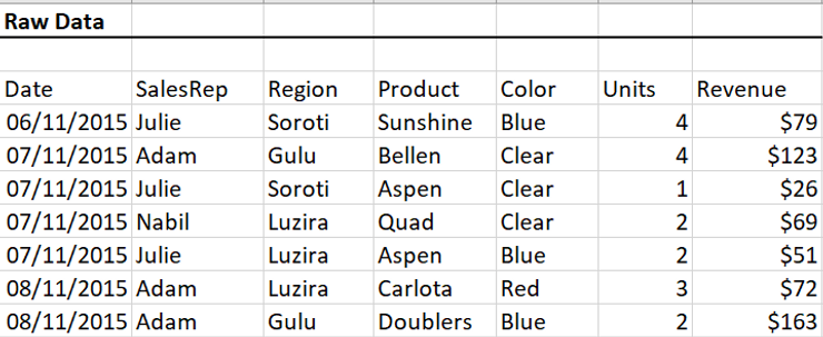
Preview of sales data
Time check: 8.32PM
The data range has 7 columns: Date, SalesRep, Region, Product, Color, Units and Revenue. Before we start the analysis, we find out the column names, the number of columns and the number of rows in the dataset, by using 2 useful shortcuts: “Ctrl + [direction arrows]” and “Ctrl + Shift + [direction arrows]” (For Mac users, use Command in place of Ctrl). Click in any cell in the data range and try them out to see how they work.
By clicking in the first cell at the top and clicking “Ctrl + ↓”, we see below that the dataset has 9,974 rows of data. Depending on how much data you work with, you’re either indifferent to this number or hyperventilating. Jane is a mess right now.
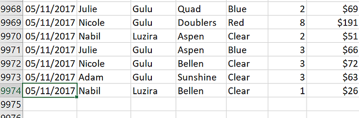
Bottom of the data range showing 9,974 rows
Yücel wants a summary of revenue by region over the past 3 years. Jane is wondering how to summarize 9,974 rows of data in a few hours while tipsy. Jane’s concern is valid, and before pivot tables, this task would take several hours. Not anymore.
Time check: 8.34PM
Before using pivot tables in Excel, one must check 4 things:
Step 1: Every column must have a header – CHECK
We know all the columns in our data have headers
Step 2: There must be no empty rows in the data – CHECK
There is a way to do this, but we are not going to tackle it in this post (Hint: Ctrl + G, then Go To Special when data range is selected). Our data does not have blank rows.
Step 3: There must be no subtotal/total rows in the data – CHECK
There is no easy way to do this except using the scrollbar to check for totals/subtotals within the data. There are none in our case.
Step 4: Make sure the data range is in a special Excel table
While this is not compulsory, I highly recommend it because special Excel tables allow your pivot tables to update whenever new rows of data are added to the dataset. We could do a whole post on special Excel tables but let’s wait for the next time Jane procrastinates. To convert the data range to a special Excel table, we click anywhere in the data range and press Ctrl + T. Green “crawling ants” appear around the border of our data range, and a Create Table window pulls up as shown below. We double check the range, leave “The table has headers” checked and click OK.
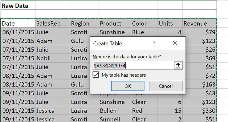
Create Table window showing desired range
The data is now in a colorful special Excel table. You can change the color of the table in the toolbar. Excel gives you several options, but I always choose to clear all the color because I am a minimalist. Step 4 – CHECK.
Time check: 8.35PM
We click anywhere in the table, and go up to Insert on the toolbar. Instead of clicking PivotTable in the top left corner, we click Recommended PivotTables.
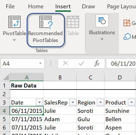
Click Recommended Tables
Below, in the Recommended PivotTables window that pulls up, Excel does the Lord’s work, looks at the data and suggests relevant pivot tables. Look at that! The first suggested pivot table is our desired summary report—Sum of Revenue by Region and it is already selected by default. We click OK and Excel places the pivot table in a new Sheet. Jane has her summary sales report and emails it to Yücel.
Time check: 8.40PM.
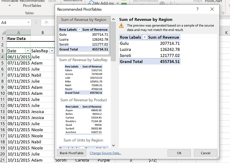
Recommended Pivot tables
Here is the final pivot table below.
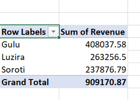
Final Pivot table
Jane’s problem has been solved in record time and she is on Twitter singing this blog’s praises. However, we should create the pivot table from scratch because things won’t always be so simple. Jane should probably be here, but she never learns.
Click undo in the toolbar or press Ctrl + Z until you return to the point before we created the recommended pivot table. Click anywhere in the table, go back to Insert but click PivotTables in the top left this time. As shown below, a Create PivotTable window pulls up. Leave Select a table or range selected, and instead of New Worksheet, select Existing Worksheet.
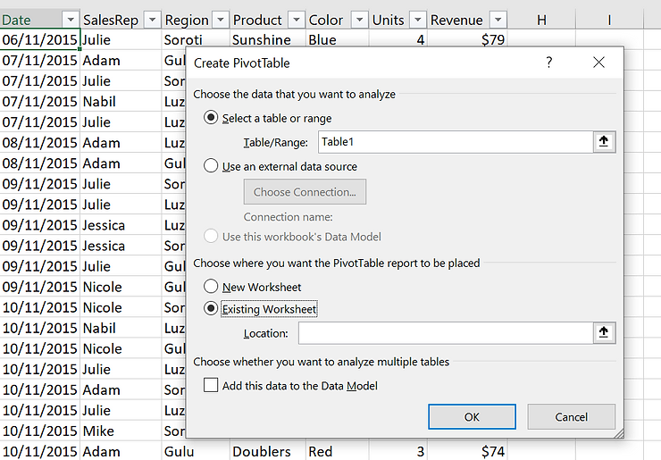
Create Pivot table window
After selecting Existing Worksheet, click inside cell K5 (you can click any empty cell in the worksheet; don’t cram), so we can have the PivotTable beside our data table. The green crawling ants will appear around cell K5 and its reference (Sheet1!$K$5) will appear in the Location box below Existing Worksheet in the Create PivotTable window. Thereafter, click OK.
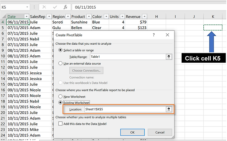
Click K5 to place pivot table there
A graphic appears where the pivot table will be with a PivotTable Fields side panel on the extreme right.
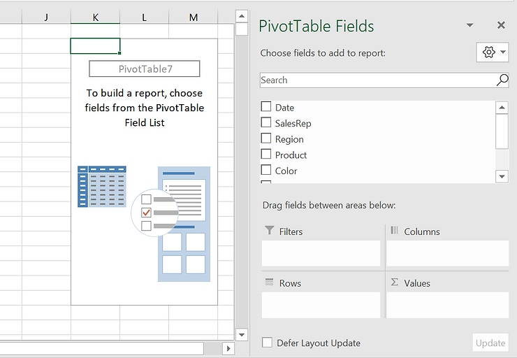
This is the slightly tricky part. The PivotTable Fields side panel has 5 boxes: 1 at the top containing all the column titles in our data table, and 4 below named Filters, Columns, Rows and Values (take a gander in the figure above). To create our pivot table, we visualize what we want our desired table to look like and drag the relevant column titles from the column list to the requisite box below (Filters, Columns, Rows or Values).
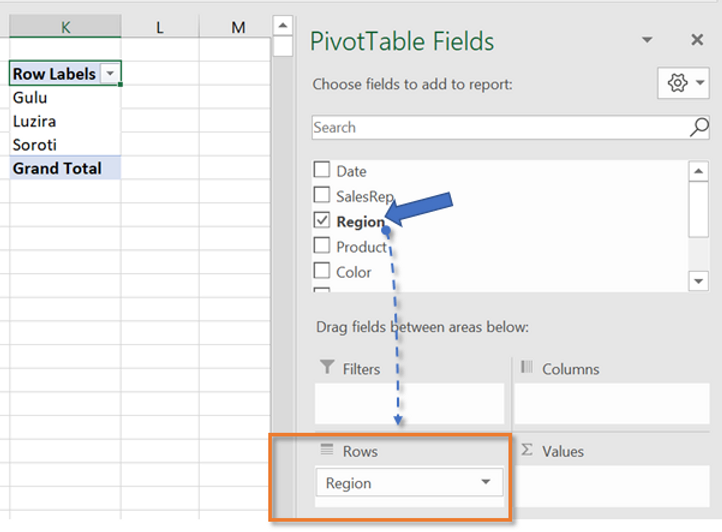
We want a summary report of Total Revenue by Region. When we visualize our pivot table, the table will have 2 columns: Region and Revenue. Each Region will be in a separate row with the corresponding Revenue in the adjacent column. Therefore, we find the Region column title in the column list, click, hold, drag it and drop it into the Rows box. Notice our pivot table on the left is populated with the Region names.
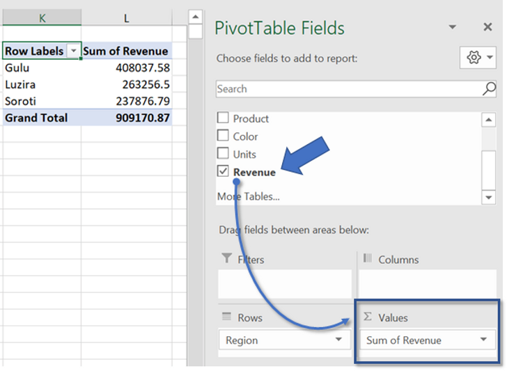
To get the Revenue by region, we find Revenue in the column list box, click, hold, drag and drop it into the Values box. Always place numerical values in the Values box. Our pivot table is complete!
The Filters box is for columns you want to filter by. For example, if you wanted to see a breakdown of revenue in the Regions by SalesRep or Date, you would click, hold, drag and drop SalesRep or Date into the Filters box. The Columns box allows to view data in columns. It is easier to learn this by trial and error. Drag Region to the Columns box instead and leave Revenue in Values. Do you see what happens? You’re a pro!
Revenue dropped in Values box and pivot table is ready
Pivot tables are pivotal for basic analysis. While this example was limited to bailing Jane out, there are tons of features in pivot tables, such as expressing values in percentages, creating pivot charts, adding slicers and timeline for dashboards, etc. For your homework, try to create the other recommended tables suggested in the shortcut using the long cut, explore the other features in pivot tables and replicate this process in Google Sheets.
Thanks, Jane. Your trials made for a great teaching moment for us.
To keep up with Big Sleep Arts and Jane, or just to learn a thing or two, please consider subscribing to this blog if you haven’t already. Later!